
Case Study | SPANI Developments
TO DOUG SPANI’S CLIENTS, RENO IS NOT A FOUR LETTER WORD.

Web Pages and Magazine Ads Pictured | Spani Developments is a custom home builder and commercial developer on the Sunshine Coast of British Columbia. We rebranded and relaunched them to the local community. Unlike their competitors they also take on extensive commercial work; including the recently added new wing to the St. Mary’s Hospital in Sechelt and the Painted Boat Resort in Pender Harbour. They specialize in working in remote locations; some only accessible by water. They design and build local services including roads, water and electricity to these locales. Aside from these large projects they also do extensive home renovations; large and small.


To present the Spani Brand to both the residential and commercial markets we proposed a unique media buy. Instead of using the traditional or expected media channels for new home construction, we proposed targeted messages each focusing on a particular aspect of the Spani Brand; in Realtor publications. Generally this where new or resale home buyers look first.
The feeling being that with the limited new home availability on the Sunshine Coast, people in existing homes may not be able to find that perfect place. They may in fact already be living in it and should consider renovating. If they were going to build a new home they would find Spani anyways in the traditional fashion on the internet or word-of-mouth.
We chose a publication called the Sunshine Coast Realtor Guide. It’s a full, tabloid size, full colour newsprint publication jammed with listings and tiny ads. We created half-page spreads (or “Double-truck” ads) utilizing new dynamic photography, bold colour, minimal copy and captivating headlines. We ran the ads on alternate months for a year. The campaign was so successful it was updated and repeated monthly the next year.
There were individual ads for new home builds, renovations, landscaping and servicing, integrity of their company, the high quality of their work, their commitment to the local economy, the environment and the unique west coast lifestyle.
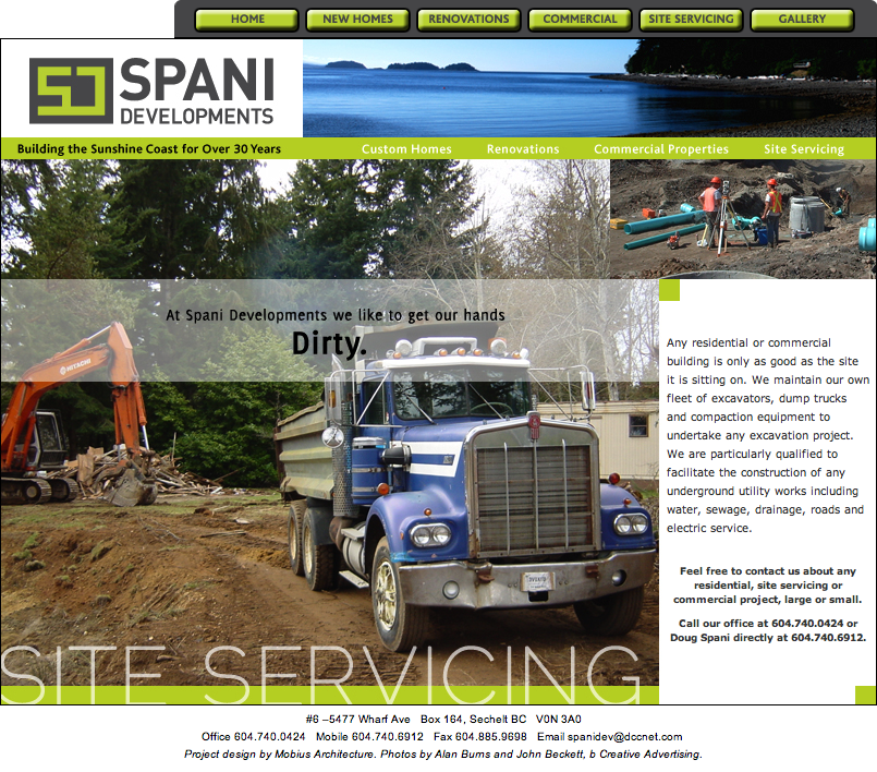
We also carried through the look, feel and content of the print to their new website which had a response vehicle attached – it became very busy. We also redesigned their site signage to make it bolder and more captivating to passers-by.
POWERFUL RESULTS | They increased traffic to their website significantly and doubled their phone enquiries, resulting in a 15% increase in business the first year.
MEDIA | Media planning, research, implementation and coordination. Print, outdoor, exterior signage, web design and social branding. Shown above are two “Double-truck” spreads in the Sunshine Coast Realtor Guide and three of the website landing pages.
b Clear. b Concise. b Creative.